“There is a small but growing group of designers that have a passion for designing business”
Uncategorized
Links of the week #4
Archive and Estate is a divinely beautiful set of photographs.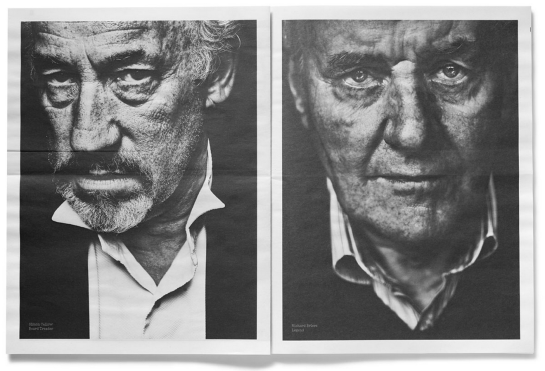
Links of the week #3
“The genius was completely in its presentation; rather than reporting the public results of a data set, the Times turned it into an interactive quiz, making every reader a lab rat.”
Links of the week #2
Links of the week #1
Longer reads
The New Yorker: The Virologist – How a young entrepreneur built an empire by repackaging memes
Victory Journal
Victory Journal is, and continues to be, one of the best executed magazine sites around. Whilst simple in construction, it makes stunning use of photography, illustration and typography to bring stories to life, particularly on some of it’s longer features, such as this one, about former MLB pitcher Orlando Hernandez’s escape from Cuba.
Material Interaction
A strong demonstration of some of Material Design’s animation and interaction principles from Jongmin Kim. It shows how the key interaction principles founded in dimensionality and tactility lay the foundations for some really satisfying interactions.
Vine shifts from comedy clips to valid journalistic tool
“Just as the tweet is the boiled-down version of the blog post, which is the boiled-down version of the essay, a Vine is the boiled-down version of a TV package, which is a boiled-down version of a documentary,” says Marc Blank-Settle
Vine shifts from comedy clips to valid journalistic tool, via The Guardian
Illustration in product design
via subtraction.com
Illustration has suffered greatly since the start of visual media, but the incorporation of illustration by Google in their new Android Calendar app shows what a strong visual asset it can be. Whilst the style itself is a little twee for my tastes, it brings a degree of warmth to the experience that vectors struggle to attain.
Apple’s new typeface, San Francisco
Apple very quietly have released their new custom typeface, San Francisco, within a bundle of developer tools called ‘Watchkit’. Contained within a folder sat 23 variations of the new Apple system font.
From the looks of it, it has been inspired by Helvetica and FF Din, and works well on smaller displays. It remains to be seen as to whether it will be rolled out to the rest of Apple’s products.
You can download the fonts here.


